Web Evaluation Assignment
Computer System and Browser Information
Both websites were evaluated on a Dell Optiplex 960 PC with an Intel Core Quad Processor (3.0 GHz) and 8.00 GB RAM. The browser I used was Mozilla Firefox which was run through my school's fiber optics network.
URLs and Web Site Choices
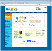
Missouri Credit Union - URL: http://www.missouricu.org. I chose to evaluate the Missouri Credit Union because it is a site that I visit frequently. It happens to be my bank. Additionally, the Missouri Credit Union recently launched a new marketing campaign that included a new slogan, new logo, new color schemes for all their marketing materials, as well as a revamped website. I thought it might be interesting to see how the website looked with the changes. As I looked through their code, I noticed the use of external style sheets and a lot of CSS styles.
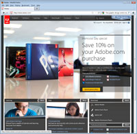
Adobe Systems - URL: http://www.adobe.com. I chose to evaluate Adobe's website because I use it frequently. I teach the Adobe software in my digital media classes and rely on this site, especially after a major upgrade, to keep me informed of the latest updates and for classroom resources.
User Testing Summary
|
Missouri Credit Union
- Design: The Missouri Credit Union website was recently redesigned to correspond with their new marketing campaign which included a new logo, color scheme, advertisements, etc. Variations of blues and oranges were used throughout the website with the new logo prominent at the top of every page. Navigation buttons appeared both down the left side and across the top of the page; some going to the same location but using different wording. The same basic structure is used through the website. The home button appears prominently in the upper left hand corner. All images checked included alt, height and width attributes. None were serving as thumbnails linking to a larger image, but rather as links to other pages or other sites. The site utilized external CSS style sheets and java scripting. The site offered links to download both Acrobat Reader and Flash Player, however, no where did I see the need for either within the site. The font style read: "Font-family: verdana, arial, Helvetica, sans-serif". On my browser, it appeared as a good strong sans serif font. Where there was a colored background, text was either white or black. On supporting pages where the background was white, text was organized hierarchically by color: H1s were a dark teal color, H2s were a deep gray, and paragraph type was a lighter gray with some information bolded. Text hyperlinks were the usual blue with visited links the usual purple color.
- Content: Content on this site was organized very efficiently and navigation was relatively easy. There was a title on every page that included the wording "Missouri Credit Union" and then the specific page. All links were clearly and appropriately labeled and served a very specific purpose. I found no broken links and all material seemed to be very up-to-date. Information on the site appears to be what one would expect of a bank website. There were links to home banking, home and auto rates, online loan applications, checking and savings account information, etc. This site is very useful for members of the credit union but also serves as a source of information for those searching for a bank/credit union.
- Credibility: There was no "author" specified, however, a copyright date of 2010 was indicated. Credibility is further established by logos from the Equal Housing Lender, National Crediit Union Association, and Excess Share Insurance companies. No specific contact person was identified. There was an "Email MCU Help Desk" link which went to helpdesk@mcu.org and multiple phone numbers for various locations but no specific person. The credit union does market its services so I am assuming there may be some bias in how they present information, but basically, it is a factual web site. Specific services provided are listed; current rates, how to apply for a loan, etc. All material appears to be original. There were photographs of individuals with no copyright or permission information included, however, they were members of the credit union and photos were used as part of a testimonial type event. I found no spelling, grammar or punctuation problems throughout the site. Nowhere on the site did I find a creation or date updated. There was a copyright 2010 indicator.
|
|
Adobe Systems
- Design: The navigation bar is across the top of the website. At the bottom of the website are blocks for what I would assume are popular links (learning, help, and downloads). A large ad occupies much of the home page, marketing the newest versions of the Adobe software (CS5.5). Tints of grays make up the buttons and background colors with either white or light blue text in a relatively small font. The light blue is a bit difficult to read. Most of the navigation buttons are self-explanatory, however, there is one button named "solutions" which I wasn't really sure what it would reveal. Basically it is a page devoted to how Adobe products can be used in various businesses, education, advertising, etc. There is a link back to the home page, however, the button is the Adobe logo, rather than something that specifically says "Home".
Adobe uses a lot of videos for training and for marketing. The videos were quick to load on my computer. External CSS style sheets and Java scripting was utilized throughout the site. There were a lot of mouse-over pop-ups. All images that I moused over included alternate text, though most did not use a height or width attribute, nor were they there to be used as thumbnails. I can only guess that the sizing of the photographs took place prior to design of the page. I found some of the text to be fairly small. The text in the light blue font was hard to read. While all the text in blue text were links, the blue was a lighter blue; they could have stuck with the regular blue link color and it would have been more visible. The lighter blue doesn't contrast with the gray very well.
- Content: The text in the title bars were inconsistent from page to page. Some pages say "Adobe" and then the particular page, like Adobe Solutions; others don't have Adobe in the title but only the page being linked to. Some are in lowercase and others in upper case. As mentioned above, the light blue links are hard to see/read and don't stand out enough. Otherwise, the words themselves are descriptive for the most part. All links that I used worked, however, there are a lot of layers within this website. I know if I find something I really like and don't bookmark that particular page, I may have trouble finding it again because I use so many different parts of this site. For example, in the learning section, there are a lot of resources in the "education resources" section, however, I've also used videos from Adobe TV and the " training and certification" page. I utilize this site often, however, the content is pertinent to my curriculum. This site is specifically for Adobe users or those interested in purchasing Adobe products.
- Credibility: Like the Missouri Credit Union, there was no specific author identified. There is a lot of information about the Adobe company, its social responsibility, commitment to employees, community involvement, environmental sustainability, etc. I could find no specific email address in which to email someone at the company. There were links for trouble-shooting , customer service, and support, and feedback areas for reporting, however, there was no email address. There was also a list of all the company office locations with directions and phone numbers, but again, no email. The main purpose of the site is to sell Adobe products, so there is definitely bias, but it is a commercial site. There was no creation date or a date updated included, however, there was a 2011 copyright.
|
Layout and Design Features: Strengths and Weaknesses
Missouri Credit Union
The strength of this website is that is it relatively easy to navigate. The two navigation bars, the one on the left and the one at the top, both work to take you to some of the same pages, only using somewhat different language. For example, on the left bar there is a link to Money Center which takes you to the multitude of checking, saving and investing options. At the top there is a direct link to Checking and one to Savings. Another strength for me is the easy sans serif font choice for the main content of each page against the white background. As someone who has to wear glasses, especially when in front of the computer, I am very aware when the combination of font size and color against a background make it difficult to focus.
There are very few weaknesses in design; however, I did find one page with coding errors. On the Deposit Insurance page, the page required scrolling through the page with no table of contents section. There were "return to the top of the page" links, however, when clicked on, they did not work. There were other supporting pages that did have a table of contents and the "return to the top of the page" links worked such as the Home Loan Frequently Asked Questions page. I mentioned navigation as a strength, however, I did have problems finding the bank lobby hours. I was actually trying to find this information and had to really dig a bit to find it.
Adobe Systems
The strength of this website is in the content. If there is anything you need or want in relation to Adobe products, this is the site to start. While I would not recommend anyone buy the software directly from this site (it can be found cheaper elsewhere), you can find out all the information you need to know about each specific product. In addition, they offer a lot of education and training options and have good trouble-shooting options.
As mentioned above, some of the weaknesses, for me, lie in the design and navigation. The small font size, along with the light colored font, either light blue or gray, sometimes on a colored background, made it difficult for me to read without increasing the text size on my browser. Because of the vast size of this site, there are a lot of layers within this website and keeping track of where specific things are, as mentioned above in the content section, can be over-whelming.

